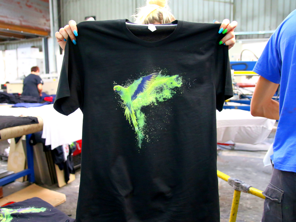
Doing graphic design, and doing graphic design particularly for t-shirt printing can mean two totally different things.
While most graphic designers know their craft, it is crucial for managers to also know the basics.
When you know the fundamentals, you are able to work and communicate more effectively with your designer(s).
Moreover, you are able to prevent some common problems. Did you know designers really dislike when you send them a logo of poor quality? Also, you don’t want to spend hours working with your designer, only or to have the printer tell you the design you sent doesn’t work t-shirt printing.
How to have the artwork ready for T-shirt printing and make sure you are happy with the final result?
Here are some fundamentals, just to keep in the back of your head.
Adaptability
The artwork should always adapt to the final format. That means the designer needs to know precisely what the artwork is going to be used for, and what will be the printing method.
For example, when the artwork is meant for t-shirt screen printing, it is necessary to separate colors into different layers.
Direct to garment technique is great at recreating small details. So if the artwork is meant for DTG, it needs to be the highest achievable quality.
Resolution
All printing methods need high resolution. Adjust the resolution of the images you send to your designer to make sure you are giving them a high-resolution file.
If your picture does not have the wanted resolution (usually at least 300 DPI – dots per inch), you can always change it using the right software, like Photoshop.
Colors
When you can, use Pantone Codes for colors in your artwork. This makes the color separations a lot clearer and more precise.
Identifying exactly which Pantone color you’re using will prevent a few common mistakes down the road.
If you are thinking RGB and CMYK, always go with CMYK, since it is the color printers use.
Furthermore, the artwork you send needs to have a transparent background. Surely you don’t want a weird square of some color to be printed around your image.
All text needs to be converted to outlines
This is an important step that designers tend to sometimes forget, and you should know why they need to remember to do it.
If the fonts are not rasterized, there is a possibility that the design will be accidentally changed when the fonts are substituted.
When that happens, the printer needs to contact you, you need to reach out to the designer, and everyone’s time is wasted.
When the designer converts the text to outlines, any computer that opens the file sees the font as an image, and the problem is solved.
The size
The artwork should be generally created in its final size. Also, if you can, give a suggestion to your designer to use vector artwork as much as possible. This makes color separations easier and the print comes out cleaner in the small details.
These basic tips to keep in mind should cover most of the difficulties you might face.
If you need custom clothing, and you are looking for a partner known for the extremely high quality of service and technology (like Masaprint ;), you can GET IN TOUCH WITH US HERE.


